Graphic design · Print · Brand systems — Canberra & NSW
Graphic design & branding for real estate — One brand.Every surface.
Signboards, booklets, stationery, information memorandums, social templates — designed as one system, so your agency looks like one business everywhere it shows up. From full rebrands to tightening the brand you already have.
Brands we’ve built for & worked inside
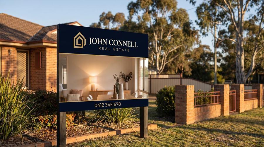
- John Connell Real Estate
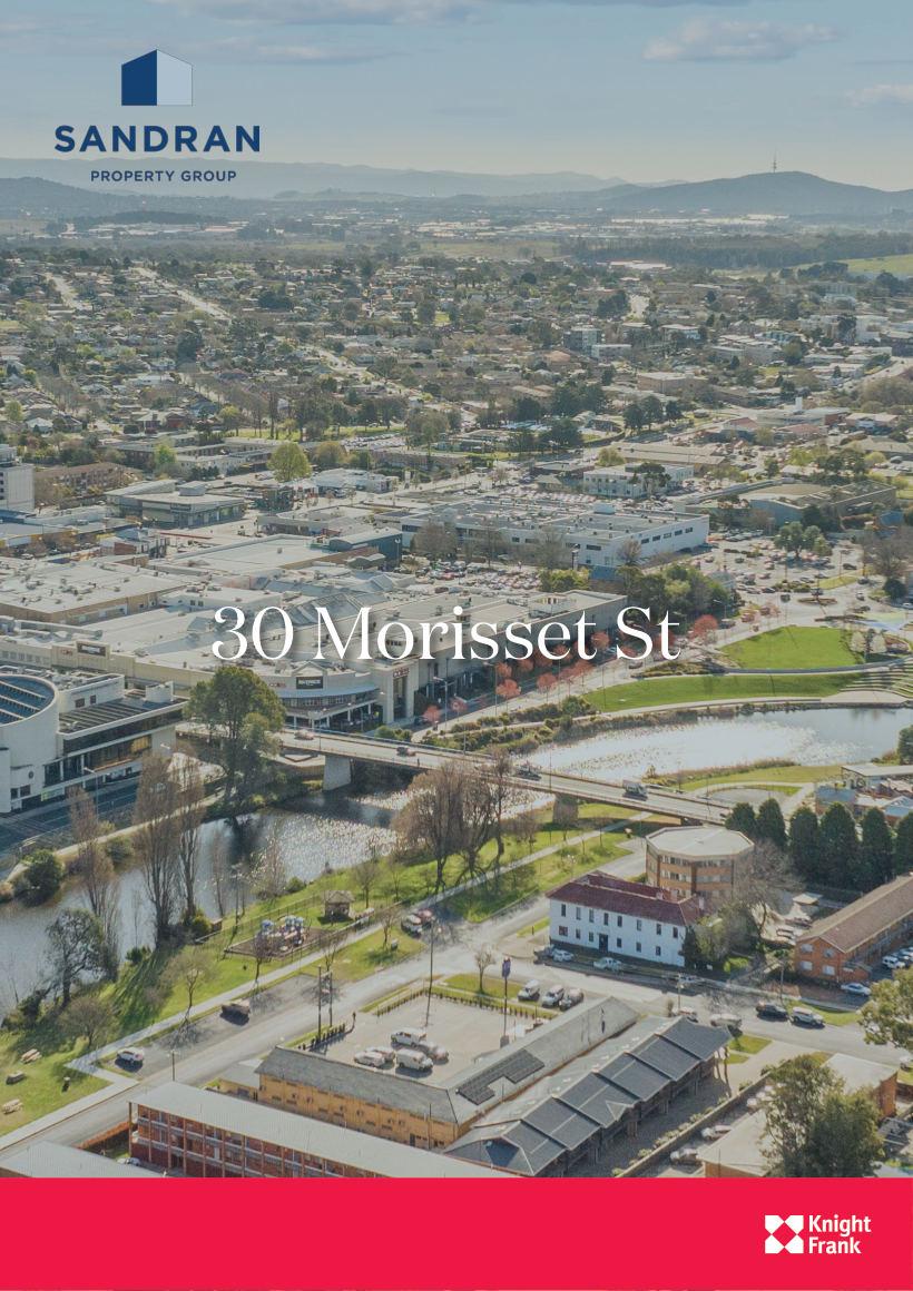
- Knight Frank
- Exceed Homes
- AM Property Agency
- Roberson Construction
- Barton Commercial
Who you’d be working with
A real estate marketing agency that happens to design.
Patorama shoots the photography, produces the video and floorplans, builds the websites, and designs the print. Design sits on top of doing all the rest of it.
Which means we already know what a signboard has to do at forty metres, what a portal does to an image, and what a pre-list booklet is actually for.
Not a design studio learning real estate. A real estate business that designs.
40+
Assets in a day-one brand rollout
6
Formats carrying one brand system
16pp
Appraisal booklets, designed & printed
Pantone
To vinyl & CMYK, physically matched
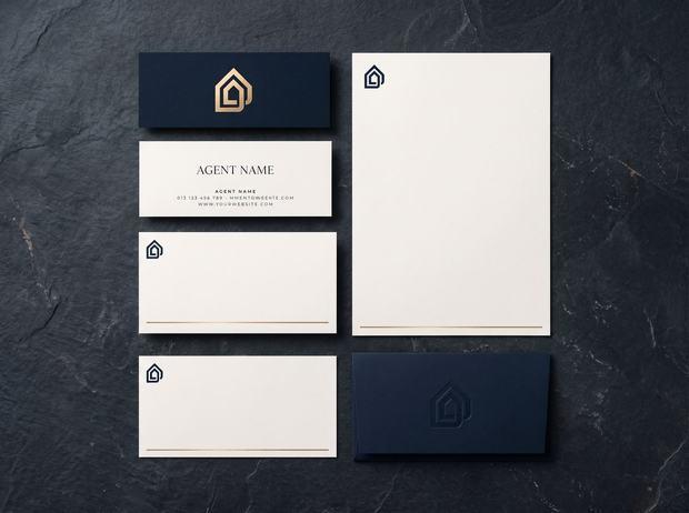
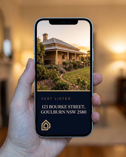
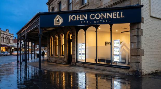
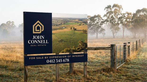
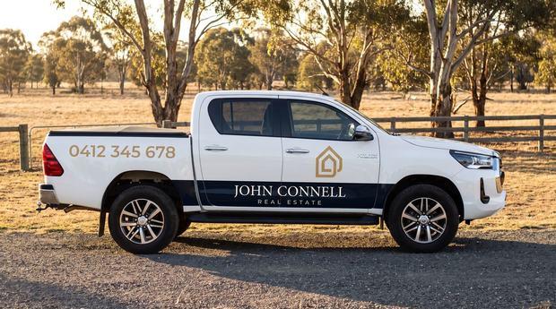
Full brand rollout — John Connell Real Estate · Goulburn NSW
One agency. Every surface.
A complete agency brand, built and rolled out from day one: signage, stationery, booklets, listing templates and the spec sheet the whole team works from.
The system underneath
The same brand, six formats.
Stationery through to a sixteen-page appraisal booklet, an open home A-frame and the social templates — one identity, carried without drift.
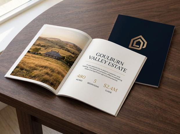


Every colour specified to Pantone with a physical vinyl swatch match — because a signboard, a printed booklet and a phone screen don’t agree unless somebody makes them.
Graphic design & branding services
The sort of thing we take on end to end.
From complete brand strategy for a new agency to a single booklet that has to be right. Every engagement leaves you with master files, print specifications and rules your whole team can follow.
01
Identity application
Logo lock-ups, single-colour and reversed variants, favicon, clear-space and minimum-size rules. The difference between having a logo and having an identity.
02
Colour & type
CMYK, RGB, HEX, Pantone and vinyl match for every brand colour. Type hierarchy with licensing sorted, so nobody is guessing at a font in three years.
03
Stationery
Business cards, letterhead, with-compliments slips and email signatures that actually match the signboard out the front.
04
Signage
Every board status, A-frames, shopfront fascia, window graphics and vehicle livery — specified to substrate, so the printer gets it right first time.
05
Print collateral
DL flyers, just-listed and just-sold cards, window cards, market updates, appraisal and pre-list booklets. Print-ready art, not a JPEG in a Word doc.
06
Document design
Information memorandums, build-approach booklets, inclusions schedules and market reports. Type doing the structural work so a client can actually follow it.
07
Digital templates
Social templates, EDM layouts, portal listing formats, video lower-thirds and end cards — the same system your print runs on, sized for screens.
08
The brand spec sheet
Every asset, its format, its print specification, and where the master file lives. The document that stops your brand drifting the moment we hand it over.
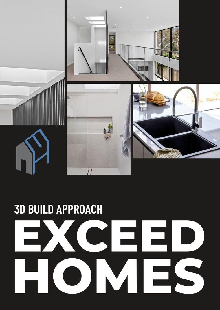
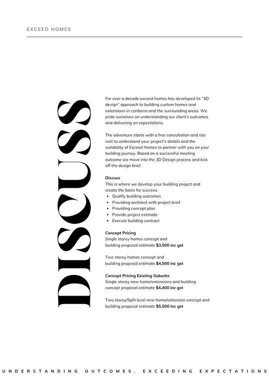
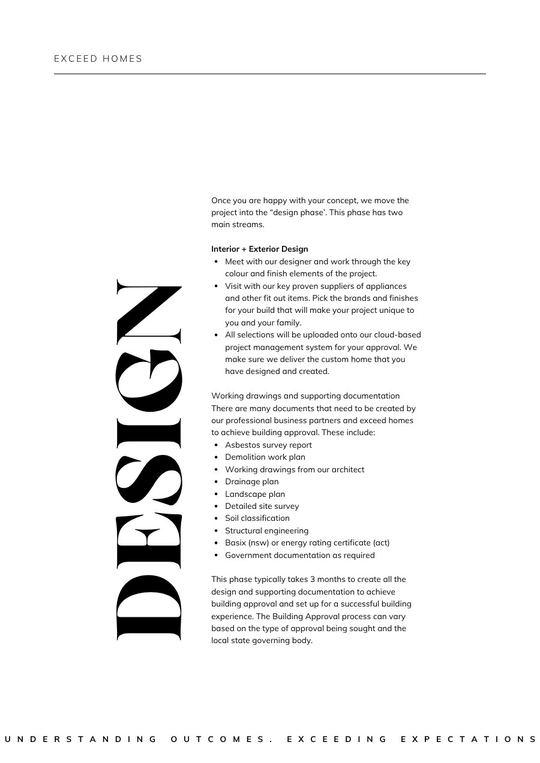
Document design — Exceed Homes
Explaining a process, not just decorating a page.
A build-approach booklet that has to carry staging, pricing and inclusions without reading like a contract — type doing the structural work so a client can follow it.
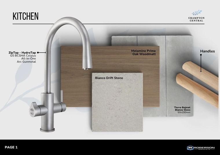
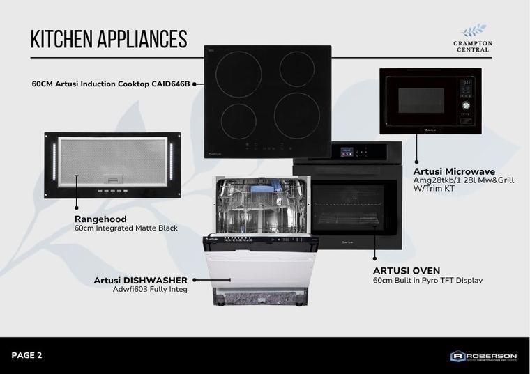
Schedules & inclusions — Crampton Central · Roberson Construction
Selections and inclusions, made legible.
Annotated product schedules a buyer can read and a supplier can order from. The unglamorous end of the work, and the part that stops questions coming back.
Built once, used weekly
One template. Different listings, different agents, every week.
This is the engine an agency needs after launch day — built once, then filled in by the agency’s own people rather than coming back to a designer every time.
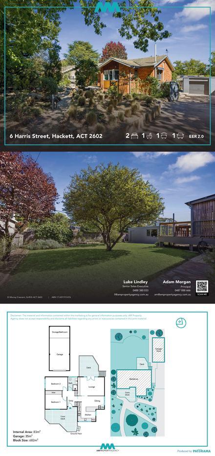
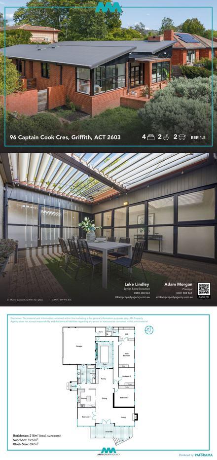
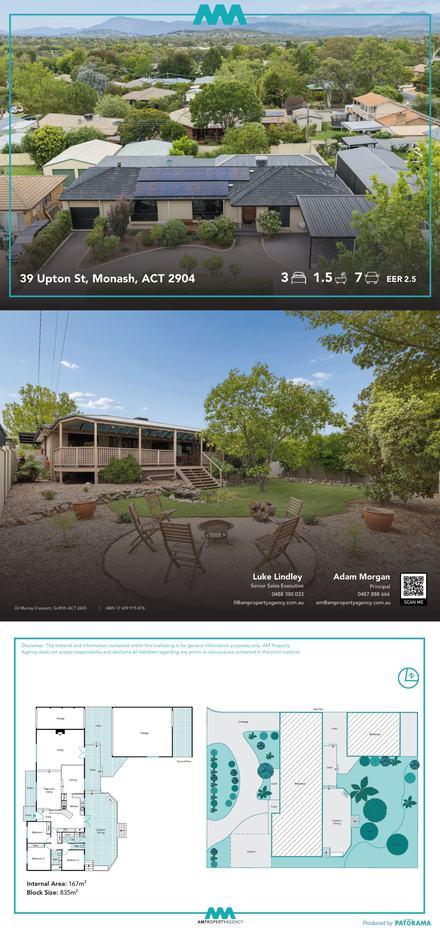
A live listing pipeline — AM Property Agency
A full listing kit, running as a production line.
Booklet, fact sheet, just listed, just sold, auction invite, signboard sticker — per agent, per listing, with a naming convention and a production queue behind it.
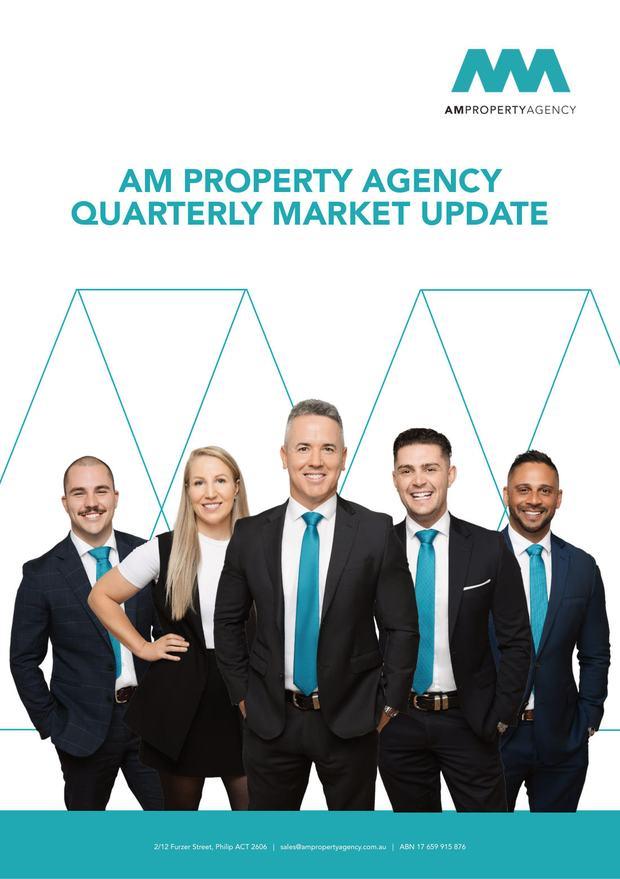
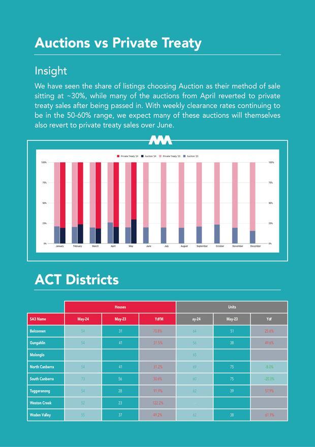
Plus quarterly market reporting: data, charts and commentary set to the same system.
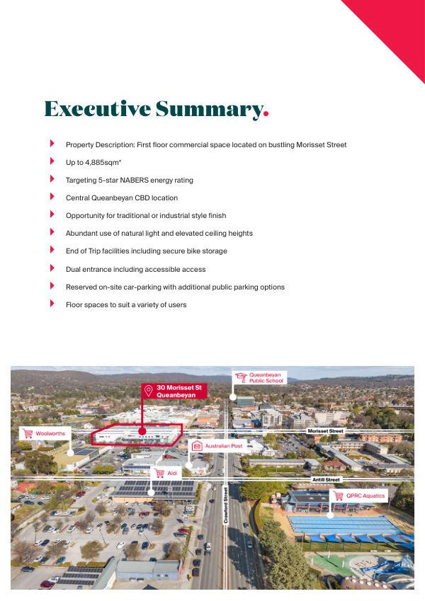
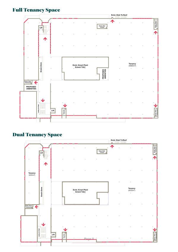
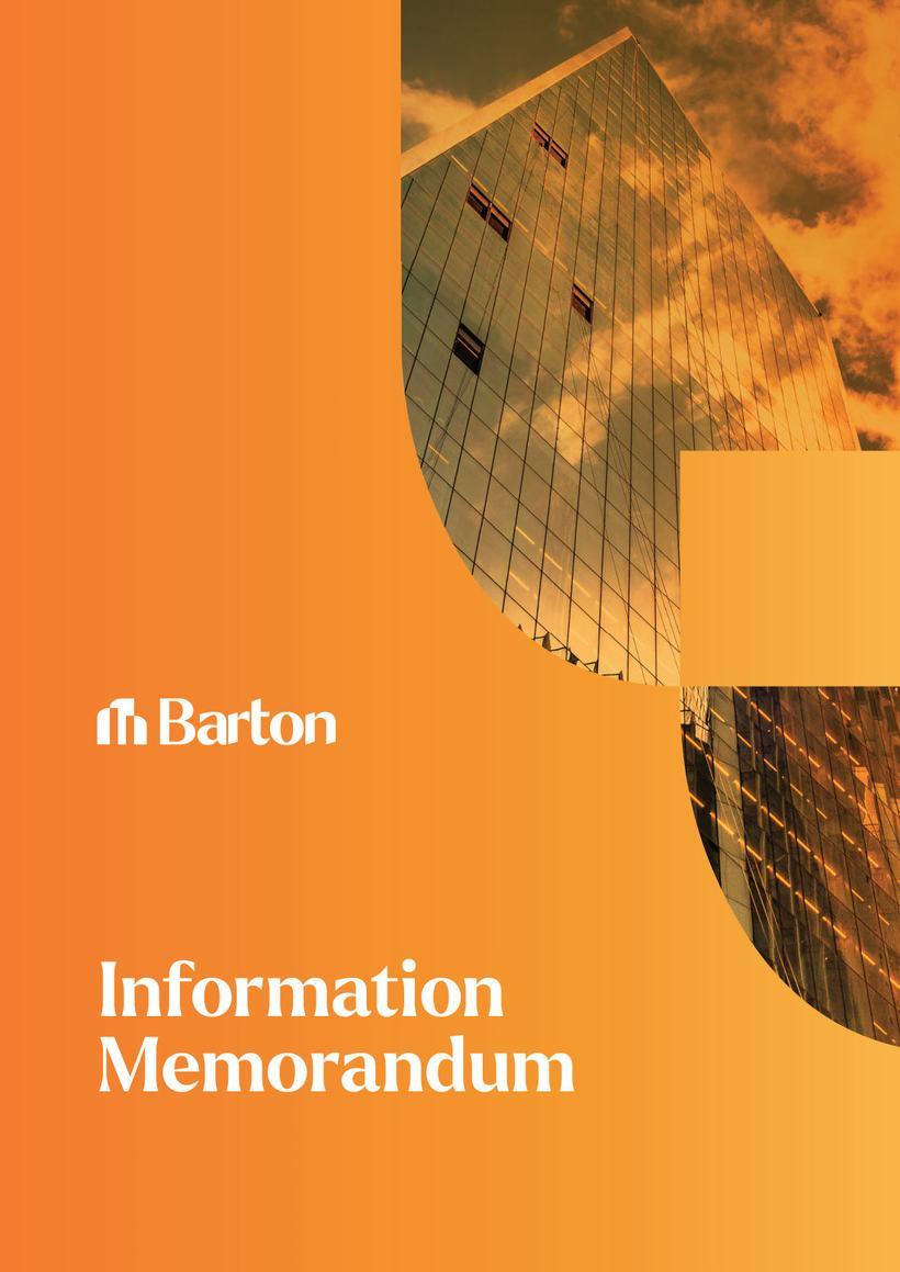
Brand alignment — Knight Frank · Barton Commercial
We work inside other people’s brands without breaking them.
This information memorandum sits inside two brands at once — Knight Frank’s global identity and Sandran Property Group’s, on the same cover, neither compromised.
If your brand already has rules, we follow them to the letter. If it doesn’t, that’s usually where we start.
Rebranding or starting fresh
From brand audit to day-one rollout.
01
Brand audit
We lay out everything carrying your brand today — boards, cards, portal listings, socials — and show you where it drifts. That’s the starting point whether you’re rebranding or just tightening up.
02
The identity system
Lock-ups, colour specified across CMYK, RGB, HEX, Pantone and vinyl, type hierarchy with licensing sorted, and the rules that keep it all straight at forty metres or on a phone.
03
The rollout
The roughly forty pieces a brand needs in the wild: signage and fascia, stationery, booklets, flyers, window cards, vehicle livery, social and EDM templates. Specified to substrate, sent to print.
04
Templates & the spec sheet
Self-serve templates your own people fill in, plus a spec sheet recording every asset, its print specification and where the master file lives. Routine work stops coming back to a designer.
Real estate graphic design that survives the printer
Most brand inconsistency isn’t carelessness — it’s physics. A signboard is vinyl in full sun, a booklet is ink on coated stock, a phone screen is backlit RGB. Send the same hex code to all three and you get three different brands. We specify every colour across Pantone, CMYK, RGB and vinyl with physical swatch matches, and we specify signage to substrate, so the brand you approved is the brand that shows up on the street.
A generalist studio has to learn all of this on your job. We already know what a board has to do at forty metres, what a portal does to an image, and what a pre-list booklet is actually for, because we shoot the photography, produce the video and build the print for agencies across Canberra, the ACT and NSW every week.
Rebranding an agency without losing momentum
Leaving a franchise, merging offices, or launching independent — an agency rebrand is really a logistics problem wearing a design problem’s clothes. Every listing on the market and every board in the ground has to switch over cleanly, and the roughly forty pieces a new brand needs have to exist before day one.
We build the identity, roll it out across every surface, and hand over a spec sheet that records every asset, its format and its print specification. Your team gets self-serve templates for the per-listing pieces, so brand consistency doesn’t depend on everyone asking a designer first.
Document design: booklets, IMs and the unglamorous end
Appraisal booklets, information memorandums, build-approach guides, inclusions schedules, quarterly market reports — documents where the type has to do structural work, not decoration. We design documents that a buyer can follow, a supplier can order from, and an agent is proud to leave on a kitchen bench.
Frequently asked
Asked & answered.
What does a full brand rollout include?+
Roughly forty pieces: logo lock-ups and identity rules, colour and type specification, business cards, letterhead and email signatures, every signboard status, A-frames, shopfront fascia, window graphics, vehicle livery, DL flyers, just-listed and just-sold cards, appraisal and pre-list booklets, social and EDM templates, and a spec sheet recording every asset, its print specification and where the master file lives.
Can you work with our existing brand instead of redesigning it?+
Yes — a lot of our work is applying an existing identity properly, not replacing it. We’ve designed information memorandums that sit inside Knight Frank’s global brand guidelines alongside a second agency brand on the same cover, without compromising either. And if your brand has never had written rules, that’s usually the first thing we fix.
We’re rebranding our agency. Where do we start?+
A brand audit. We lay out everything carrying your brand today and show you where it drifts, then build the new identity system, roll it out across signage, print, stationery and digital, and hand over templates and a spec sheet so the switch is clean. If you’re leaving a franchise group, we plan the rollout around your changeover date so nothing is off the market waiting for artwork.
How do you keep colours consistent between print, signage and screen?+
Every brand colour is specified five ways — Pantone, CMYK, RGB, HEX and a physical vinyl swatch match. Print, vinyl and screens each reproduce colour their own way, so one hex code is never enough. The full specification goes into your brand rules, which means every future printer and sign shop gets the same answer.
Do you design documents like information memorandums and appraisal booklets?+
Yes — document design is a core part of the studio. Sixteen-page appraisal booklets, commercial information memorandums, build-approach booklets for builders, annotated inclusions and appliance schedules, and quarterly market reports with data and charts set to your brand system.
Can our own team use the templates, or does everything come back to you?+
The per-listing pieces — property booklets, fact sheets, just-listed cards, social posts — are built as self-serve templates your team fills in. Agencies run them weekly across different listings and agents without touching a designer. We stay involved for the pieces that genuinely need design, not the routine ones.
Do you only work with real estate agencies?+
Agencies are our home ground, but the same system thinking covers builders, developers, commercial property and local businesses that want their brand to hold together — Exceed Homes, Roberson Construction and Barton Commercial are all on this page. If your marketing has a graphical or printed element, we can take it on.
Do you handle printing as well as design?+
We deliver print-ready artwork specified to your printer’s requirements — substrate, stock, finish and format — and we can manage the print run and installation coordination with suppliers we already work with across Canberra and NSW. Either way, what comes back from the printer matches what you approved.
Anything not here? Email [email protected]
Whenever suits
Happy to walk you through any of it.
If there’s a piece of this that would take something off your desk — a rebrand, a booklet, or the whole forty-piece rollout — we’d be glad to have the conversation. Book a time below, no pitch attached.
Or just say hello via the contact pagePrefer email? [email protected] · 0483 987 570